Stunning Visuals and Pixel Perfect Interface
The initial app UI needed refinement and engagement elements necessary for a seamless user experience. The challenge was to design a comprehensive store page UI and create assets that enhanced the visual appeal and functionality. Additionally, ensuring pixel-perfect alignment and consistent spacing across all screens was crucial. An entirely new store flow was developed to boost engagement, featuring daily check-in prizes and a minigame. This project demanded extensive communication and weekly meetings to refine the design and meet the evolving needs of the app.
Accuracy & Precision
Revised existing screens for visual consistency, established an app-wide grid system for future designs, and enhanced elements to improve overall aesthetics.
Designing a Coin & Marketplace
The Original
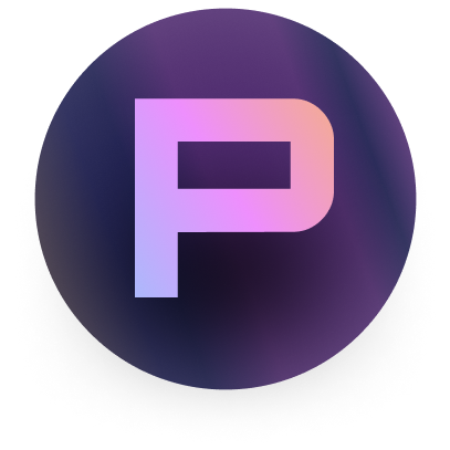
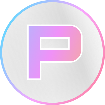
I incorporated the "P" from the app name, Player 2, into the currency design. To match the app's aesthetic, I used a standard white color on a dark, vibrant background but adjusted the coin colors to better align with the overall visual style.
Iterations


The Final Coin
The final design better incorporated the app's colors and featured a metallic sheen


